
Introduction
Fashion is self-expression, and color coordination is essential to a finished style. Colors can greatly affect how others view you and your outfits. Understanding outfit matching colors may boost your style, whether you’re dressed up for a major occasion or wearing a casual outfit. Color theory underpins fashion color coordination. Understanding color associations lets you develop beautiful color combinations that improve your appearance. Color theory includes primary, secondary, and tertiary colors, warm and cool palettes, complimentary and analogous colors, and triadic color schemes. Harmony and balance in your clothing depend on each of these factors. Colors also affect mood. They convey emotions, moods, and sentiments. Colors can affect how others see you and the mood you create. Color can help you appear confident, friendly, or sophisticated.
Outfit matching requires a color pallet. Choose a base hue and add complimentary, analogous, or triadic colors to make visually appealing outfits. Neutrals balance bold and bright colors, giving your clothing adaptability and flexibility. We’ll cover clothing color matching in this complete tutorial. We’ll cover color theory, psychology, palettes, accessories, and event dressing. This article will teach you how to effortlessly construct well-matched clothes that leave a lasting impression. Let’s explore color matching together.
Color Theory:
Outfit matching starts with color theory. Color connections and combinations can help you design harmonious outfits. Color theory’s essentials:
Primary, Secondary, Tertiary Colors:
Primary hues in color theory are red, blue, and yellow, which cannot be mixed. By mixing primary hues, purple, orange, and green are created. Mixed primary and secondary colors create tertiary colors.
Warm and Cool Color Palettes:
Colors inspire warm or cool feelings. Reds, oranges, and yellows exude vitality, passion, and vibrancy. Blues, greens, and purples are soothing.
Analogous and Complementary Colors:
Blue and orange or red and green are complementary colors on the color wheel. Complementary hues provide a stunning contrast. Blue, green, and teal are analogous colors. They match well.
Triadic hues are three colors evenly spaced around the color wheel. Red, yellow, and blue are triadic. These pairings create colorful, harmonious outfits.
Understanding these color theory basics helps you coordinate outfit colors. Using the color wheel, you can create an appealing and coherent outfit. Experimenting with color combinations lets you create distinctive and elegant clothes that express your personal style. After reviewing color theory, let’s examine color psychology and how it affects fashion.
The Psychology of Colors in Fashion:
Colors have a powerful influence on our emotions and perceptions. In the realm of fashion, understanding the psychology of colors can help you convey specific messages, evoke certain moods, and create the desired impression. Let’s explore the psychological effects of different colors in fashion:
- Red:
Red is a bold and attention-grabbing color associated with passion, energy, and excitement. Wearing red can make a statement and exude confidence. It’s often chosen for formal occasions or to draw attention to specific elements of an outfit.
- Blue:
Blue is a calming and serene color that evokes feelings of tranquility, trust, and reliability. It’s often considered a versatile color in fashion and can be used to create a sense of professionalism or a relaxed vibe depending on the shade and context.
- Yellow:
Yellow is a cheerful and optimistic color that symbolizes happiness, creativity, and warmth. It can add a vibrant touch to outfits and is often associated with a playful and lighthearted mood.
- Green:
Green is associated with nature, growth, and harmony. It represents freshness, balance, and renewal. Wearing green can create a sense of tranquility and connection with the natural world.
- Purple:
Purple is often associated with royalty, luxury, and creativity. It combines the energy of red with the calmness of blue, resulting in a color that can convey elegance, sophistication, and individuality.
- Orange:
Orange is a warm and energetic color that represents enthusiasm, vitality, and excitement. It can add a playful and lively touch to outfits and is often associated with a sense of adventure.
- Pink:
Pink is a color often associated with femininity, romance, and sweetness. It can range from soft and delicate shades to bold and vibrant ones. Pink can evoke a sense of tenderness and charm.
Understanding the psychology of colors allows you to strategically incorporate them into your outfits to evoke specific emotions or create a particular mood. By selecting colors that align with the impression you want to make, you can enhance your personal style and communicate your desired message to others. In the next section, we will explore how to build a color palette for your outfits and achieve harmony and cohesion in your fashion choices.
Building a Color Palette:
Harmony and balance in ensembles require a well-coordinated color palette. By selecting a base color and incorporating complementary shades, neutrals, and accent colors, you can create visually pleasing and cohesive ensembles. Let’s examine the important steps in color palette creation:
Base Color:
Choose a base color for your outfit. This color may suit your skin or be a favorite. Consider the event and your desired attitude. Black, blue, gray, and white are foundation colors.
Exploring Monochromatic Looks:
Choose base color colors and tones to create a monochromatic look. Varying color lightness or darkness gives dimension and aesthetic intrigue to your clothing. Monochromatic outfits are chic and elegant.
Incorporating Neutrals for Balance:
Neutrals such as black, white, gray, and beige are versatile additions to any color palette. They balance and ground your ensemble, highlighting other hues. Neutrals can be bases or accents.
Complementary Colors for Contrast:
Selecting complementary colors is an effective way to create contrast and visual interest in your outfits. Choose complementary colors from the color wheel. For example, if your base color is blue, pair it with orange accents for a vibrant and eye-catching look.
Accent Colors to Make a Statement:
Accent colors are bold hues that add a pop of color to your outfit. They can be used sparingly in accessories, such as a statement bag, shoes, or jewelry, to create focal points and draw attention. When incorporating accent colors, ensure they complement and harmonize with the overall color palette.
Building a colour palette allows you to create cohesive outfits that reflect your personal style. Consider the mood, occasion, and your own preferences when selecting colours. Experiment with different combinations and explore the impact of different hues on your overall look. By following these steps, you can confidently build a colour palette that enhances your outfits and makes a lasting impression. In the next section, we will explore the concept of harmonising with complementary colours and achieving contrast in your fashion choices.
Harmonising with Complementary Colours:
Complementary colours add contrast and charm to outfits. These colour combinations may make a dramatic fashion statement when utilized harmoniously. Harmonising complementary hues requires these steps:
Complementary Colours:
Colour wheel opposites are complementary. Blue-orange, red-green, and purple-yellow are common complementing combinations. Find the complementary pair that matches your base colour or wardrobe mood.
Contrast and Visual Appeal:
Pairing complementary hues creates high-contrast, making each colour stand out. This contrast makes your clothing more interesting and lively. A blue top with orange embellishments is striking. Balancing Consider strength and proportion while using complementary colours. One colour can dominate and the other accent. If your foundation hue is a light pastel blue, utilise vivid orange accessories to add contrast without overpowering the outfit.
Subtle Complementary Pairings:
Complementary hues can be subtle. For a more refined aesthetic, consider subtle complementary color variations. Deep burgundy and mild sage green provide a soothing color combination.
Cohesiveness with Neutrals:
Black, white, gray, and beige neutrals help ground complementing hues. To avoid overdoing the look, use neutrals as a backdrop or accessories.
Harmonizing complementing hues can generate eye-catching outfits. Complementary colors give your look depth and dimension. To identify complimentary color pairings that suit your aesthetic, try bold or subtle combinations. Analogous colors create coherence and depth, which we will discuss next. Analogous hues create a beautiful and balanced color palette. Analogous hues in your clothing provide cohesiveness and fluidity. Let’s look at how comparable colors create cohesion:
Choosing Similar Colors:
Choose a color wheelbase color and the colors on either side. Blue-green and blue-violet are analogous colors for blue. These hues naturally match and blend into your clothing. Analogous colors add depth and harmony. Different intensities and saturations of similar colors can provide depth and visual appeal to your clothing. Create contrast and focal points with lighter and darker colours.
Balancing Warm and Cool Tones:
Analogous color schemes might include warm and cool tones. Select analogous hues based on mood and circumstance. Warmer similar colors, like yellow-orange and red-orange, are vivid and active, whereas cooler analogous colors, such blue-green and green, are serene and tranquil. Anchoring comparable color schemes with neutrals is important. To let similar colors shine, use neutrals like white, black, or gray as basis colors or accessories. Neutrals also keep an outfit from being too busy.
Gradual Color Transitions:
Use comparable colors in your clothing to create a seamless look. Gradient effects or numerous comparable hues can achieve this. Your ensemble flows and harmonizes. You can build harmonious outfits by using comparable hues. These colors blend well for an attractive look. Try comparable color combinations to find ones that suit your style and mood. We’ll look at triadic colors’ lively and balanced look next.
Mixing and Matching Triadic hues:
Triadic hues add vibrancy and balance to outfits. You may make creative, confident outfits by choosing colors evenly scattered around the color wheel. Let’s learn the basics of triadic color mixing:
Recognizing Triadic Colors:
Triadic hues are three color wheel-equidistant colors. Red, yellow, and blue are common triadic pairings. These colors make a powerful fashion statement with a balanced and dynamic palette.
Balance color intensity when using triadic colors. Choose one color to dominate and two to accent. This keeps the ensemble balanced. Establish a triadic color hierarchy to create an attractive ensemble. Use one color as the base and the other two as accents. This highlights your clothing.
Triadic color pairings allow imaginative exploration. Don’t be hesitant to try new triadic combinations. This personalizes your clothing. Neutrals balance and ground triadic hues. White, black, and gray create a neutral backdrop for triadic hues. This keeps the outfit from becoming too colorful. Mixing triadic hues creates gorgeous and balanced outfits. These three evenly spaced hues appear cohesive and lively. Try numerous triadic combinations to find ones that suit your style and make a bold fashion statement. Next, we’ll discuss neutrals’ importance in outfit coordination and versatility.
Exploring Neutrals:
Neutrals are vital for outfit matching. They provide your style balance, variety, and flexibility. Neutrals’ power in creating attractive and classy outfits:
Neutral Role:
Neutrals—black, white, grey, beige, and nude—provide a blank canvas for your ensemble. They bring calm, equilibrium, and sophistication. Neutrals can improve other colours as base colours, complements, or anchors.
Minimalistic Style:
Neutrals are generally connected with ageless fashion. They’re simple, letting your outfit’s structure and details shine. Neutral tones in monochrome or tonal clothing appear chic.
A adaptable capsule wardrobe starts with neutrals. You may easily mix brighter colours and patterns with neutral core pieces like blazers, trousers, and coats. Neutrals make constructing several ensembles easy.
Colour Palettes:
Neutrals let other colours pop. Neutrals balance bright colours and keep an outfit from looking overbearing. They let you mix colours while looking sophisticated.
Neutrals are timeless. Neutral-coloured pieces can be worn year-round, extending their lifespan. Neutrals are timeless and sophisticated.
Neutrals are versatile. They can be dressed up or down for casual or formal occasions. Accessories can shine against neutrals, adding flair to your look.
Neutrals offer unlimited outfit combinations. They form a sturdy base and compliment other colours, producing a stunning outfit. Neutrals make it easy to seem classic and elegant. The next section will summarise the article’s main points and answer outfit matching colour questions.
Colour temperature affects emotion and perception. Colour temperature can help you set moods and evoke emotions in your fashion selections. Colour.
Temperature affects:
Warm Colors: Red, orange, and yellow are energetic and vibrant. High color temperature gives an outfit warmth and intensity. Warm colors can highlight your outfit.
Cool Colors:
Low-temperature colors like blue, green, and purple promote calmness, serenity, and tranquility. They calm an outfit. Cool hues convey refinement and professionalism.
Seasonal Impact:
Color temperature can reflect seasons. Summer and spring bring vibrant, energetic colors. Autumn and winter colors are cool and peaceful.
Color temperature requires consideration of your skin tone. chilly-toned people suit chilly colors, while warm-toned people suit warm colors. Knowing your skin tone helps you choose flattering hues.
Color Combinations:
Warm and cool hues contrast well. For instance, matching a warm-toned top with cool-toned bottoms adds depth and interest. Balance warm and cool hues to create a pleasing look.
Accent colors:
Accent colors liven up your clothing. Accent colors may make your outfit stand out. Use accent colors well with the following subheadings:
Choose an accent color that matches your base color and enriches your clothing. Use the color wheel to choose complementary colors. If your foundation hue is navy blue, add a bright yellow or coral accent.
Balance and Focus:
Accent colors capture attention and highlight your clothing. Strategically highlight accessories, shoes, and striking pieces. Selectively adding accent colors creates a balanced, appealing outfit.
Color Blocking:
Use separate blocks of color in your attire. Color blocking with accent colors adds vitality and enthusiasm. Color block effects are striking and modern. Try different color combinations and positions.
Visual Depth:
Accent colors offer dimension to your clothing. Use them in patterns, prints, or as contrasts to provide visual interest. A neutral dress with bright piping or a patterned item can instantly improve the look.
Complementing Neutrals:
Black, white, gray, and beige are great backdrops for accent colors. To stand out against neutral tones, use accent colors in accessories, outerwear, and makeup. This makes the accent color pop.
Accent colors let you express yourself. Try numerous colors and combinations to find your fashion accent colors. Don’t be scared to try bright colors that express your personality.
Accent colors can spice up your clothing. Accent colors highlight your style through color blocking, pattern combining, or smart placement. Try different accent colors to find your signature look. Mature varies by culture and situation. Some cultures associate blue with sadness or peace, while others associate red with luck and festivity. Consider cultural color temperature connotations when choosing to clothe for special events.
Understanding color temperature lets you use colors’ emotional and visual power. By intelligently using warm or cool hues, you may set the mood and convey your message through fashion. Try different color temperatures to match your style and aesthetic.
Colour Blocking:
This fashion trend uses opposing blocks of colour to create a dramatic and distinctive effect. You may make amazing costumes that express your style with the appropriate techniques. Colour blocking techniques:
Monochromatic Colour Blocking:
Use multiple shades and tones of the same colour in your clothing. This method is ideal for uniformity. To create a beautiful and simple look, experiment with different blue tones.
Complementary Colour Blocking:
Blue and orange or purple and yellow are complementary colours on the colour wheel. These hues contrast beautifully. This method creates striking outfits.
Analogous Colour Blocking: Yellow, green, and blue are analogous hues. These hues naturally match and seem balanced. This method creates a soft-colored clothing.
Triadic Color Blocking:
Red, yellow, and blue are evenly spaced on the colour wheel. Using three colours creates a balanced and visually appealing ensemble. Use this method to make a creative, bold outfit.
Texture and Pattern Color Blocking:
Textures and patterns provide visual appeal to your attire. Pair a sleek leather skirt with a chunky knit sweater in a similar colour. This gives your clothing depth and dimension while retaining a colour scheme.
Bold Claim Colour blocking:
Colour blocking with vivid hues creates a striking ensemble. A bright red coat with black and white pieces is excellent for this technique. This method creates a memorable outfit.
Mixing Patterns and outfits
Color blocking may make your style stand out. Color blocking may produce attractive, unique outfits. Try numerous color combinations and approaches to determine what suits your style and fashion sense.
Mixing Patterns:
Patterns and prints offer personality and visual intrigue to your clothing. Strategically using them lets you create unique, eye-catching outfits that reflect your style. Following are some ways to incorporate patterns and prints into your Outfits:
Mixing patterns entails wearing multiple prints. Choose patterns with a similar color palette or theme for a unified effect. Mix polka dots with animal patterns or striped tops with floral skirts. Try different pairings to find ones that work.
Patterned Accessories:
Adding patterns to your clothing is easy. Try printed scarves, belts, and handbags. These accessories can make an outfit stand out.
Patterned pants: Highlight your look with patterned or printed pants. Balance patterns with solids. Smaller, detailed prints are more adaptable and easier to style than huge, aggressive patterns.
Print-Blocked Outfits:
Like color blocking, print blocking includes mixing prints. Choose prints with a common color or topic to create a unified design. Pair a geometric skirt with a floral shirt. Print blocking creates lively, fashionable clothes.
Patterned Statement Pieces:
Stand out with one patterned garment. Choose a printed maxi dress, jacket, or jumpsuit. Simple clothing lets the statement piece shine.
Coordinate patterns and prints by scale and intensity. Mix large and small patterns or bright and muted prints. This balances the outfit.
Patterns and prints enhance clothing. Experimenting with prints lets you express your style, whether you mix patterns, accessorize with prints, or wear patterned clothes. Enjoy mixing patterns and prints to create eye-catching outfits.
Seasonal Color Trends:
Color influences the mood and style of each season. Knowing seasonal color trends lets you wear the trendiest hues. The following subheadings describe seasonal color trends:
Spring Color Palette:
Nature flowers and colors in spring. Spring colors include pastel pinks, light blues, mint greens, and buttery yellows. Renewing, youthful, and feminine, these colors. To capture the season, wear these subtle colors.
Summer Color Palette:
Summer is warm, energetic, and adventurous. Summer hues are bright and vibrant. Think oranges, yellows, blues, and greens. These hues are lively and vibrant. Enjoy summer with these bright colors.
Fall Color Palette:
Autumn’s colors are warm and earthy. Fall colors include deep burgundies, oranges, browns, and olive greens. These colors capture autumn’s warmth and nostalgia. To celebrate the season, wear these warm colors.
Winter Color Palette:
Winter is elegant and glamorous. Winter colors include deep blues, charcoal grays, burgundy reds, and emerald greens. These colors are luxurious and timeless. For a beautiful winter look, wear these deep colors.
Pantone Hue of the Year:
Each year, the Pantone Color Institute chooses a hue that inspires fashion, design, and other industries. This color sets trends and impacts seasonal palettes. Stay on-trend and make a stylish statement by wearing the Pantone Color of the Year.
Style Change:
Adapt seasonal colour trends to your particular style. Try different color combinations and seasonal hues that suit your style. Remember, it’s about balancing trends with your own flair.
You can incorporate seasonal colour trends into your clothing. Whether it’s pastels in spring, brights in summer, earth tones in fall, or deep hues in winter, adopting seasonal colours lets you capture the season and create trendy outfits.
Dressing for Different Occasions:
Our clothes say a lot about us and how we view different situations. Respectfully dressing for each occasion boosts confidence and comfort. The following subheadings provide tips for dressing for different occasions:
Formal Events:
Weddings, galas, and award ceremonies usually need formal clothes. Men usually wear tuxedos or well-tailored suits with dress shirts and ties. Women wear cocktail dresses, formal gowns, and stylish pantsuits. To match the event’s formality, follow invitation dress codes.
Business or Professional environments:
Dressing professionally in these environments is essential. Men wear suits and ties to work. Women can wear tailored pantsuits, dresses, or skirts with professional shirts. Choose well-fitted, sophisticated clothes over casual ones.
Casual Events:
Brunches, family gatherings, and friend outings allow for a more relaxed manner. Men can wear collared shirts or polo shirts with well-fitted jeans or chinos. Women can wear jeans, skirts, or sundresses with casual shirts or blouses. Despite the liberal dress code, it’s important to look smart and put-together.
Outdoor or recreational activities require comfort and functionality. Choose sportswear, hiking gear, or beachwear for the activity. Dress for the weather, including sunscreen, hats, and comfortable shoes.
Black-Tie Events
Black-tie events require the most formal dress. Men should wear tuxedos, black bow ties, white dress shirts, and formal shoes. Women can wear floor-length gowns or cocktail dresses with heels and chic accessories. Black-tie events are formal, so dress accordingly.
Cultural or Religious Events:
These events often include dress codes or traditional wear. Dress for the occasion. It may involve specific colors, modest attire, head coverings, or traditional garments. Respectfully dress according to the event’s cultural or religious importance.
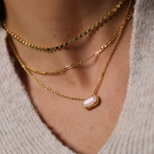
Creating Color Harmony with Accessories:
Dressing for different situations lets us match our style to each event’s expectations and vibe. Understanding dress norms for different events helps us make a good impression, feel confident, and respect the event and its attendees.
Accessories can improve your clothing and create color harmony. They let you play with colors and create cohesive looks. Let’s use the following subheadings to establish color harmony with accessories:
Complementary Color Accents:
Color wheel opposites are complementary colors. Add contrast and visual appeal to your ensemble with complementary accessories. Pair blue dresses with orange or coral accessories. Contrasting hues make your clothing pop and create harmony.
Monochromatic Accents:
Monochromatic accessories match your outfit’s color family. This produces a polished look. If you’re wearing all black, add accessories in varying colors of gray or silver to provide depth and texture while maintaining a cohesive color scheme.
Tone-on-Tone Styling:
Choose accessories in different hues of your outfit’s color. This looks elegant. If you’re wearing a navy dress, choose royal or powder blue accessories. It gives depth and harmony.
Neutral Accessories:
Black, white, beige, and gray accessories well with practically any ensemble. They base your attire and highlight its colors. To achieve equilibrium, use neutral belts, shoes, handbags, and scarves.
Colorful Accessories
Color pop accessories give vibrancy to bland outfits. To draw attention, use a crimson handbag or yellow statement earrings. These accessories can make your outfit pop.
Patterned Accessories
Patterned accessories bring color and style to your ensemble. Pick accessories with patterns in your outfit’s hues. For instance, pair a blue-and-pink floral dress with a matching scarf or handbag. This promotes harmony.
Accessories let you mix hues and create harmony. Create a balanced and harmonious style by using complementary hues, monochrome or tone-on-tone styling, neutral elements, color pops, or patterned accents. Let your accessories express your style and originality while keeping color harmony.
Dressing for Your Skin Tone:
Knowing your skin tone is Essentials Hoodie for choosing clothing colors that go well with your skin tone and improve your appearance as a whole. You may put together a coordinated and attractive look by picking the appropriate colors. Using the following subheadings, let’s discuss how to dress for your skin tone:
Warm Toned Skin:
Yellow, peach, or golden undertones can be found in warm skin tones. Choose apparel hues that suit your undertones if you have a warm complexion. Warm browns, deep oranges, deep reds, and golden yellows are examples of earthy colors that work well with warm skin tones. Warm neutral colors like camel, beige, and olive green can also amplify your inherent warmth.
Pink, blue, or purple undertones can be found in cool skin tones. If your skin tone is cool, wear colors that go well with your undertones. Cool skin tones are typically best complemented by cool colors like blues, purples, pinks, and frosty grays. Emerald green, sapphire blue, and amethyst purple are some jewel tones that can accentuate your inherent coolness.
Warm and cold undertones are evenly distributed in neutral skin tones. You have greater freedom to select hues that go well with your skin tone if you have a neutral complexion. Black, white, gray, and beige are examples of neutrals that can be used as flexible basis colors. Furthermore, muted hues like earthy tones and gentle pastels can enhance neutral skin tones.
Finding Your Undertone: There are a few techniques you can use to find your undertone if you’re unclear about the color of your skin. One technique is to examine your wrist veins; generally, blue veins denote cool undertones whereas green veins denote warm undertones. Another strategy is to watch how your skin responds to various metals; for example, if gold jewelry flatters you more than silver, you probably have warm undertones, whereas silver jewelry flatters you more than gold, you probably have cool undertones.
Experimenting with Colors: While it’s useful to be aware of which hues often go well with your skin tone, don’t be scared to try out new hues. With varied undertones, numerous color variations can look good. For instance, warm skin tones can experiment with terracotta or mustard yellow hues, while cool skin tones can experiment with various blue hues like powder blue or navy. The secret is to identify the precise hues within a color family that go well with your skin tone.
Individual Preference and Self-Assurance:
In the end, dressing for your skin tone is all about feeling good about yourself and at ease in your clothes. While standards might be useful, individual style and personal choice should also be taken into account. Regardless of conventional color theory, a color is likely to improve your overall appearance if you feel confident and beautiful in it.
You may put together a harmonious and attractive appearance by knowing the colors that go well with your skin tone and choosing apparel accordingly. The ideal colors can bring out your natural features and help you look and feel your best, regardless of whether you have warm, cold, or neutral undertones. Accept your distinctive skin tone and utilize it as a guide when choosing colors to highlight your inner brilliance.
Avoiding Color Clashes: It’s crucial to know how to avoid color clashes while designing fashionable outfits. A unified and aesthetically pleasant look can be achieved by choosing the appropriate color combinations. With the help of the following subheadings, let’s examine different methods for preventing color collisions:
Basics of Color Wheel Understanding:
Learn about the color wheel, which is a circular-shaped visual representation of colors. The color wheel aids in choosing complimentary, analogous, or triadic color combinations as well as understanding color relationships. This information provides a solid foundation for avoiding color collisions and putting together cohesive outfits.
Complementary color combinations: On the color wheel, complementary colors are found in opposition to one another. They contrast vividly, but if used in the same intensity, they can conflict. Choose complementary color combinations instead, using a range of colors and intensities. For instance, match a pastel pink top with mint green bottoms or a deep blue blouse with accessories that are mustard yellow.
Analogous color combinations are made up of hues that are close to one another on the color wheel and have a related undertone. These hues produce a unified and cohesive appearance. Choose colors with adequate contrast to prevent conflicts within related color combinations. For instance, match an olive green pair of slacks with a mustard yellow top or a deep burgundy dress with a softer dusty rose hue.
Color schemes that are monochromatic: Monochromatic clothing is composed of several tones and hues of a single color. Although this gives an elegant and streamlined appearance, take care to choose colors that differ enough to add depth and intrigue. For instance, to create a monochrome outfit with subtle contrast, wear a navy blue blazer with lighter blue slacks and a pale blue shirt.
Think about color temperatures.
A color’s warmth or coolness is referred to as its color temperature. Reds, oranges, and yellows, which are warm hues, might clash with cool hues like blue and purple. To achieve a harmonic blend when combining warm and cool colors, think about balancing the intensity or choosing neutral tones. For instance, match a warm-toned tan bag and shoes with a cool-toned lilac outfit.
Anchor with neutrals:
The neutral colours black, white, beige, and grey make ideal outfit anchors. When working with bold or vibrant colours, incorporate neutrals to balance the overall look. For example, pair a vibrant red skirt with a white blouse and black accessories. Neutrals help create visual breaks and prevent clashes between strong colours.
Test Out Colour Combinations:
Don’t be afraid to experiment and test different colour combinations before committing to an outfit. Lay out the clothing items together or try them on to assess how the colours interact. Trust your intuition and personal style while keeping in mind the colour principles to ensure a cohesive and visually pleasing result.
By understanding colour wheel basics, opting for complementary or analogous combinations, utilising monochromatic schemes, considering colour temperatures, using neutrals as anchors, and testing out combinations, you can avoid colour clashes and create stylish and harmonious outfits. Remember, the goal is to express your personal style while ensuring that the colours work together to create a visually appealing and cohesive ensemble.
Utilising Color Psychology in Experiments:
The study of how colours can affect our emotions, moods, and behaviours is known as colour psychology. You can experiment with strategically using different colours in your clothing to express a particular message or make a desired impression by learning about the psychological affects of various colours. Let’s investigate the idea of utilising colour psychology experiments using the following subheadings:
The Power of Red:
The colour red is linked to vigour, intensity, and desire. It may arouse powerful feelings and attract interest. Try adding red to your ensembles to make a dramatic statement or to project assertiveness and confidence. A red dress or a pair of red heels can immediately grab people’s attention and make an impact.
The Calming Effect of Blue:
Blue is a color that frequently evokes feelings of serenity, dependability, and peace. Try experimenting with different blue hues in your attire to achieve a calming and inviting image. A navy or light blue blazer can inspire sentiments of stability and trust, giving you a more approachable and dependable appearance.
The Optimism of Yellow:
Yellow is a cheerful, upbeat, and energizing color. Try adding yellow into your clothing to achieve a vivid and happy appearance. A yellow top or accessories can add a splash of color, radiate happiness, and make you look more approachable and amiable.
The Freshness of Green:
The color green is associated with peace, nature, and growth. Try incorporating green components into your clothing to achieve a revitalizing and energizing look. You can appear more peaceful and grounded by wearing a green outfit, such as a green skirt or green earrings.
The Elegance of Purple:
Purple is a color that is frequently connected to opulence, inventiveness, and royalty. Try adding a little purple to your clothing to achieve a refined and elegant look. You can come across as more sophisticated and stylish by wearing purple or making a statement with purple accessories.
The Confidence of Black:
The color black is associated with strength, refinement, and confidence. To achieve a sleek and powerful style, try wearing ensembles that use black as the dominating hue. Wearing a tiny black dress or a black suit might make you appear more assured and in charge.
The Joy of Orange:
The color orange is associated with joy, warmth, and zeal. Try integrating orange into your clothing to achieve a lively, energizing look. Wearing orange might make you appear more upbeat and approachable by radiating happiness and optimism.
You may utilize color strategically to enhance your clothing and convey particular ideas by experimenting with various hues and learning about their psychological impacts. Have fun experimenting with color psychology in your wardrobe while keeping the occasion, your unique style, and the impression you want to make in mind.
FAQs:
- How do I know which colors look good on me?
Understanding your skin tone can be helpful in determining which colors complement your complexion. Generally, warm undertones pair well with earthy tones and warm colors, while cool undertones are flattered by jewel tones and cool colors. Experimenting with different colors and seeking the advice of a stylist can also provide valuable insights.
- Can I wear different shades of the same color in one outfit?
Yes, wearing different shades of the same color in one outfit can create a visually appealing and harmonious look. Just ensure that there is enough contrast between the shades to provide depth and interest. Mixing different textures and fabrics can also add dimension to the outfit.
- How can I make a statement with colors without being overwhelming?
To make a statement with colors without being overwhelming, consider using a bold or vibrant color as an accent or focal point in your outfit. Pair it with neutral colors to balance the overall look. Another option is to incorporate the statement color through accessories or outerwear, creating a pop of color against a more subdued base.
- Can I wear patterns with different colours together?
Yes, you can wear patterns with different colours together. However, it’s important to consider the overall aesthetic and ensure that the colours within the pattern complement each other. Look for patterns that have a common colour or a harmonious colour palette to maintain a cohesive look.
- How do I incorporate seasonal colour trends into my wardrobe?
To incorporate seasonal colour trends into your wardrobe, start by identifying the dominant colours for the season through fashion magazines or online resources. Then, selectively add pieces in those colours to your existing wardrobe. Accessories, such as scarves or statement jewellery, can be an easy and cost-effective way to introduce seasonal colours without committing to an entire outfit.
- Can I wear colours that are considered “out of season”?
Absolutely! While seasonal colour trends can provide inspiration, there are no hard rules when it comes to wearing colours. Fashion is about self-expression, so feel free to wear any colour you love and feel confident in, regardless of the season. Mixing and matching colours from different seasons can create unique and unexpected combinations.
- How can I create a cohesive look with accessories?
To create a cohesive look with accessories, consider the colour palette of your outfit and choose accessories that either complement or contrast with the main colours. For example, if you’re wearing a neutral outfit, you can add a pop of colour with a statement necklace or a vibrant handbag. Additionally, selecting accessories that share a common design element, such as metal accents or a specific pattern, can help tie the look together.


+ There are no comments
Add yours